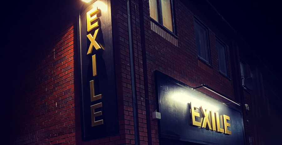
Client: Exile
Coffee & Clothing
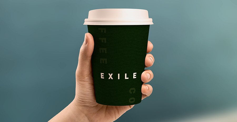
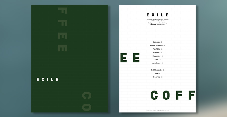
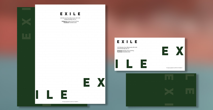
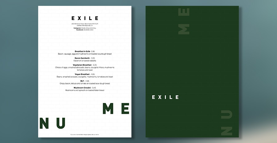
We’ve designed the look and feel of the communications for this new über-cool vintage store and coffee venue in Manchester.
The client wanted the shop frontage to utilise some bold European typography, so from the starting point of a grainy photograph of a 1920’s German storefront, we set off using a mix of Helvetica Black Condensed and Din Alternate fonts.
Beyond this simple logo, the rest of the type styling is a literal take on the shop name – we physically send parts of the words and message ‘into exile’ by breaking up text into blocks that bleed off opposite sides of the page.
Simple but effective.
